Dupont Taiwan

Visitor Management Redesign:
Streamlining Check-In/Out Process

#B2B#SaaS #Workflow Automation

Overview

The client

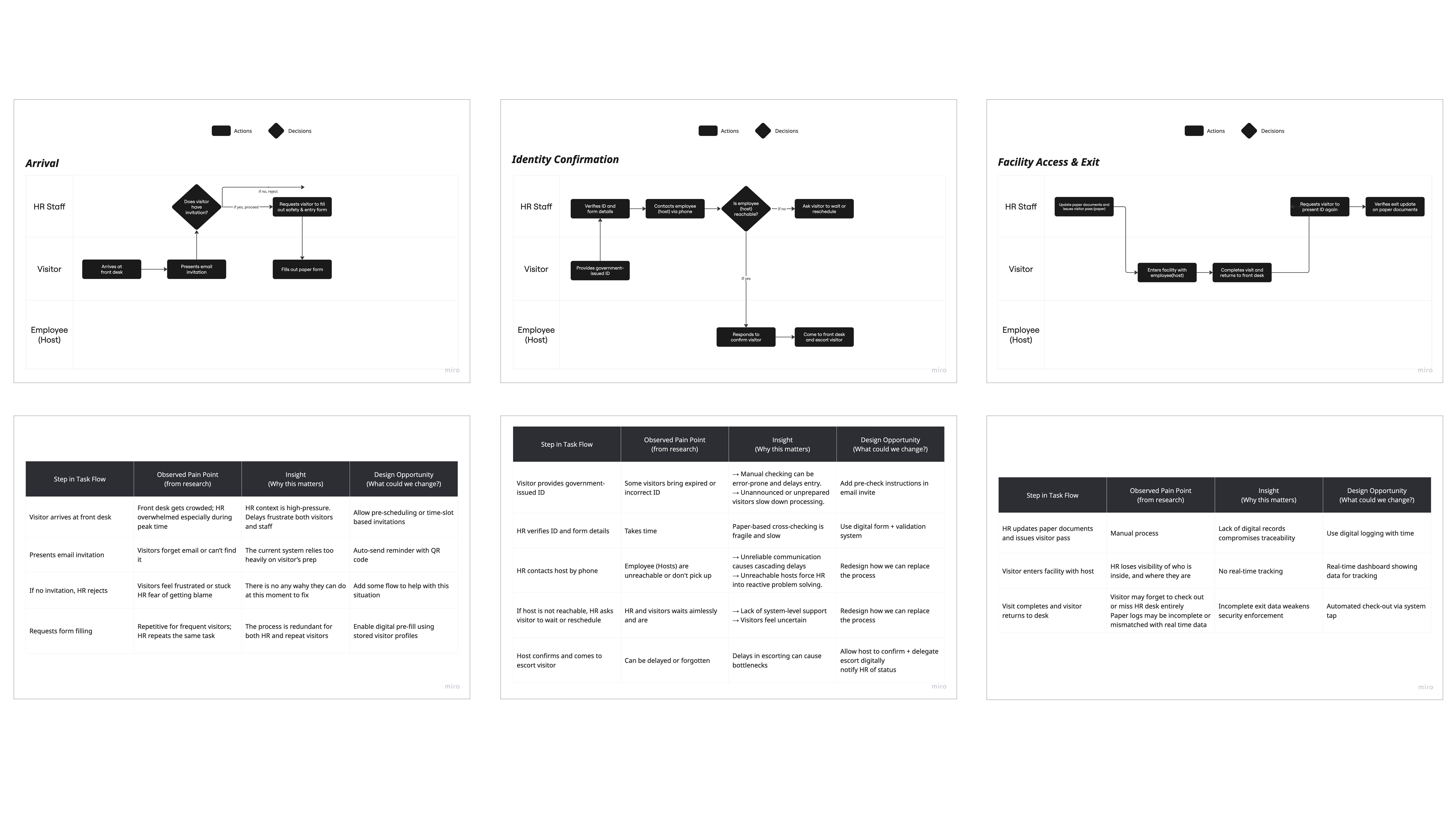
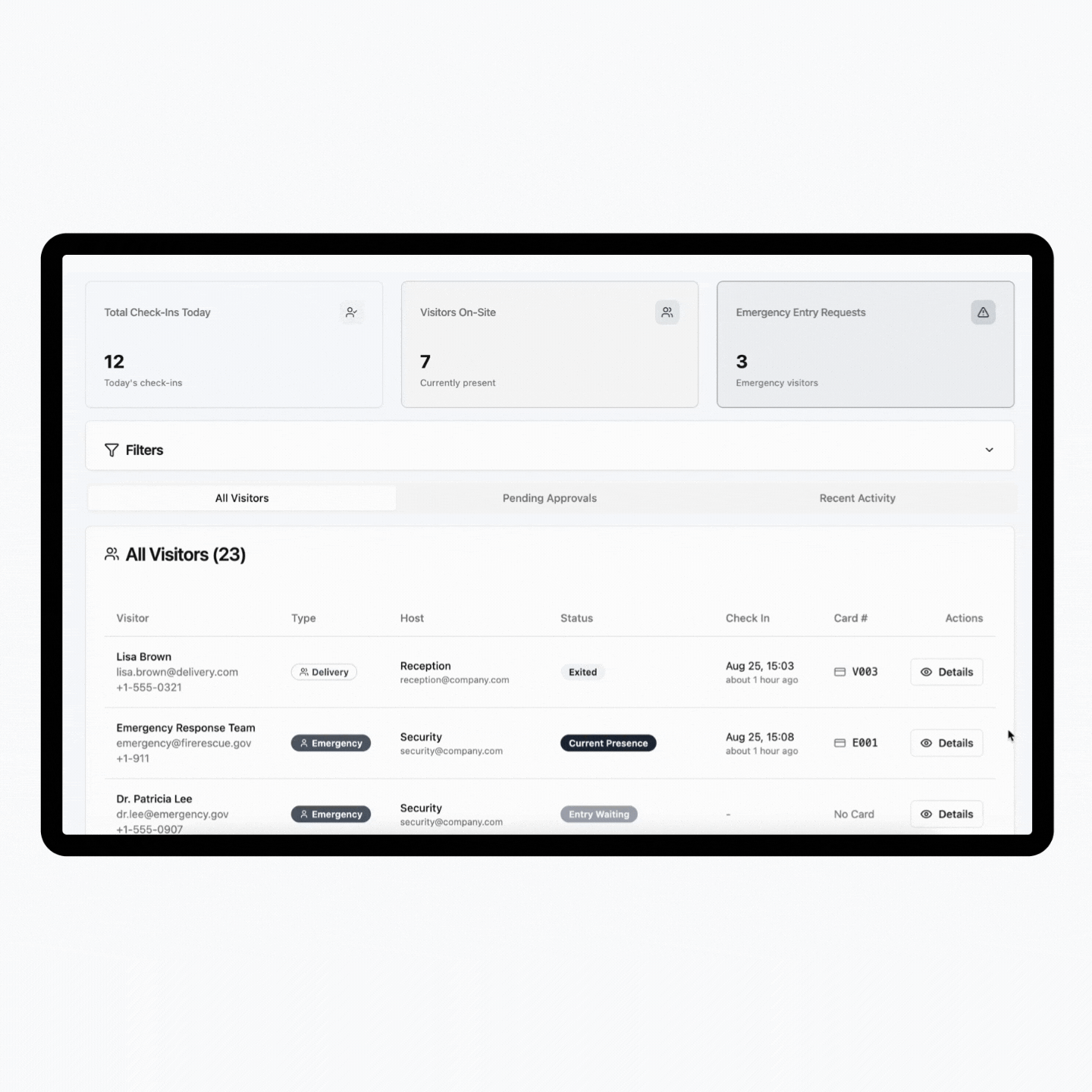
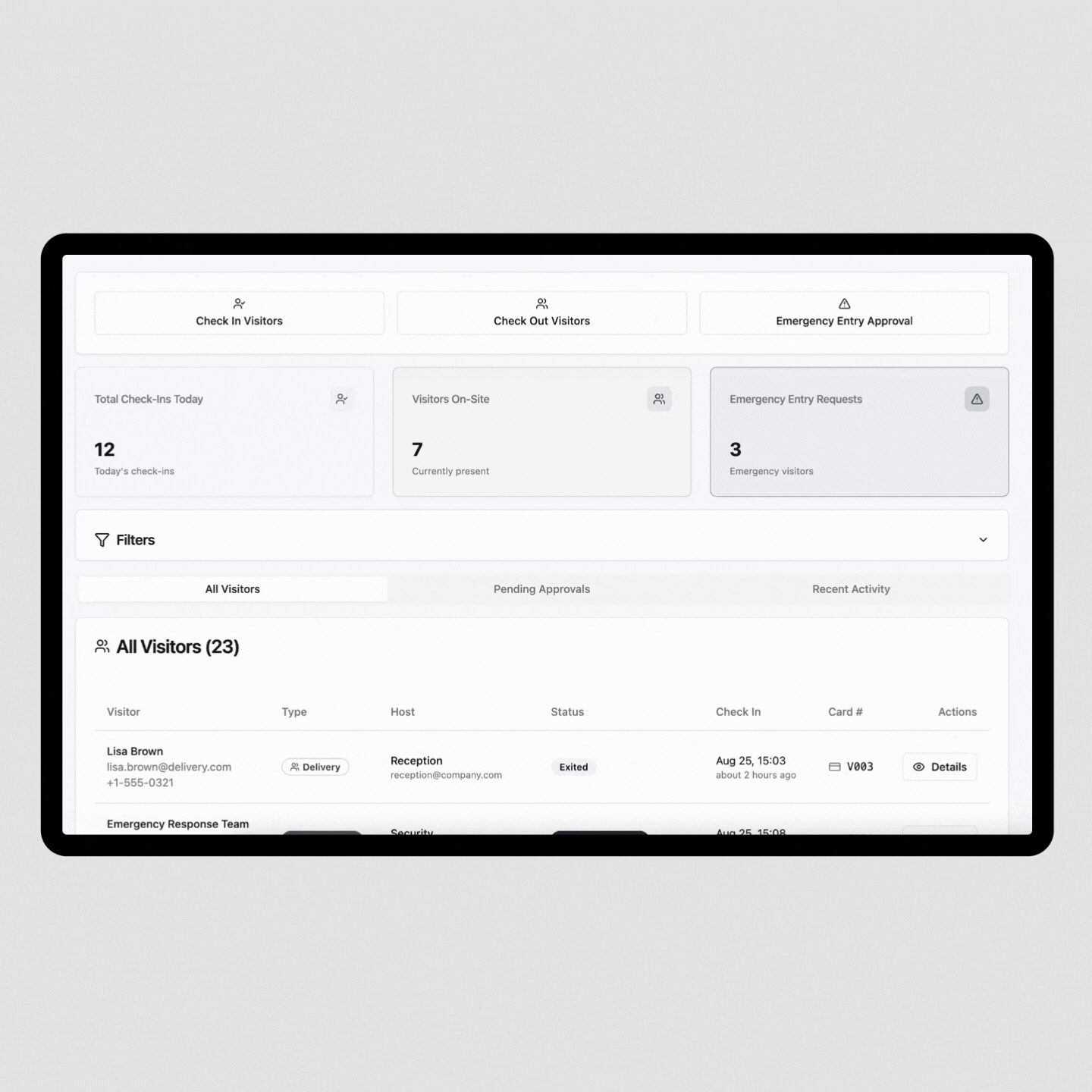
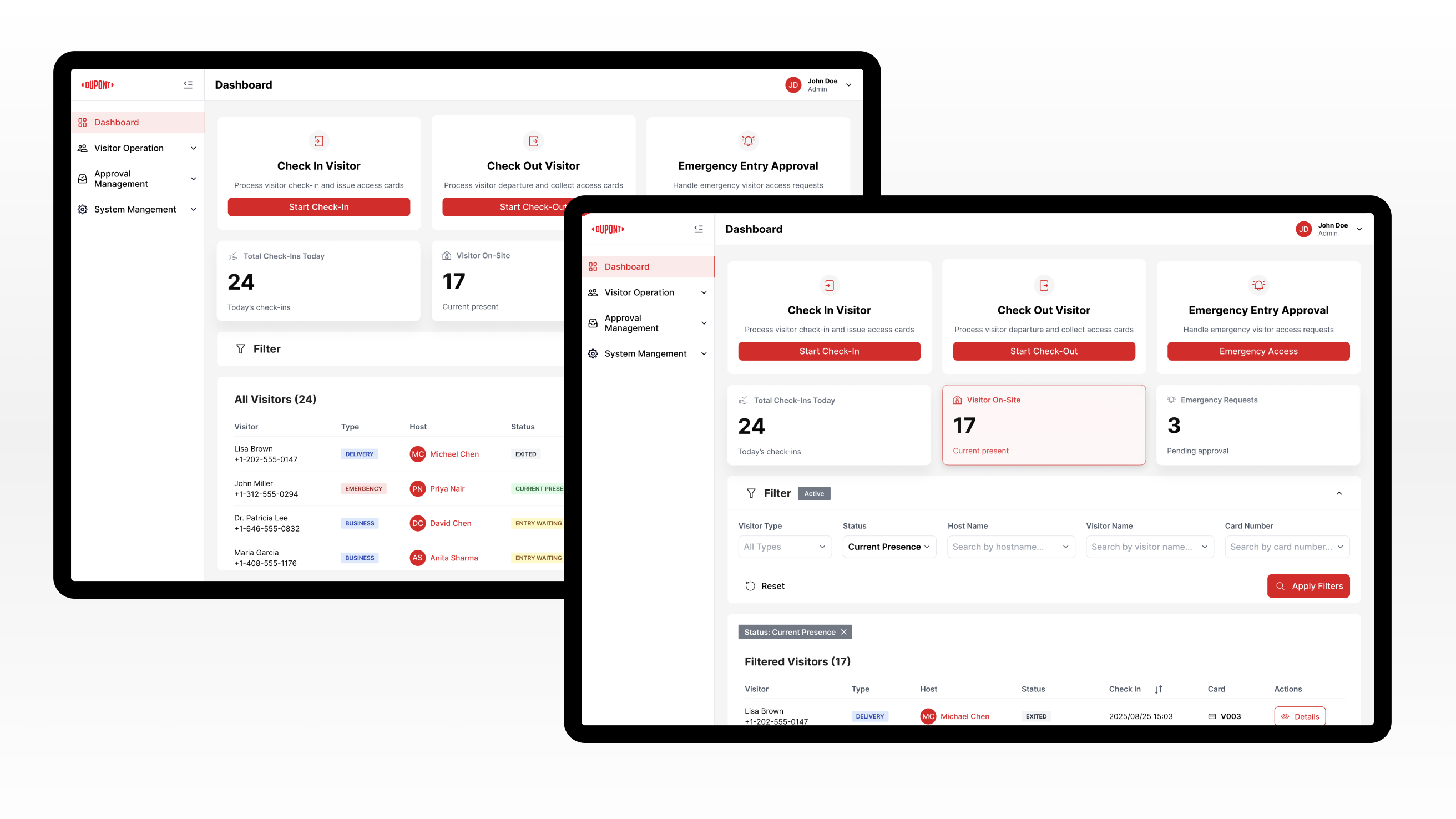
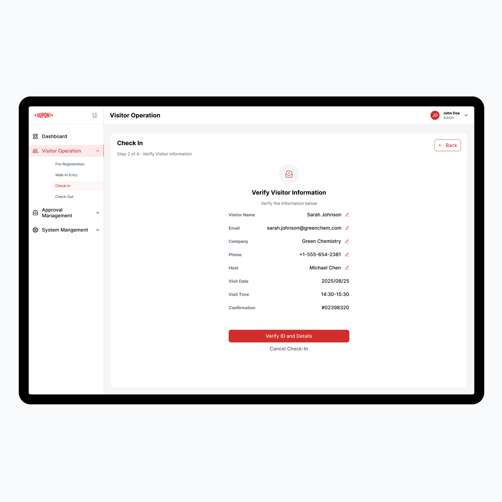
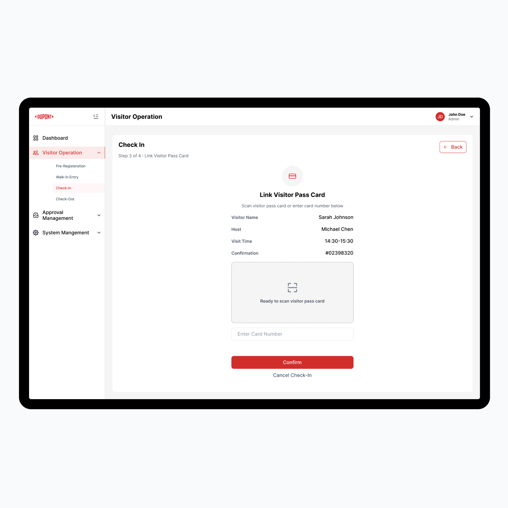
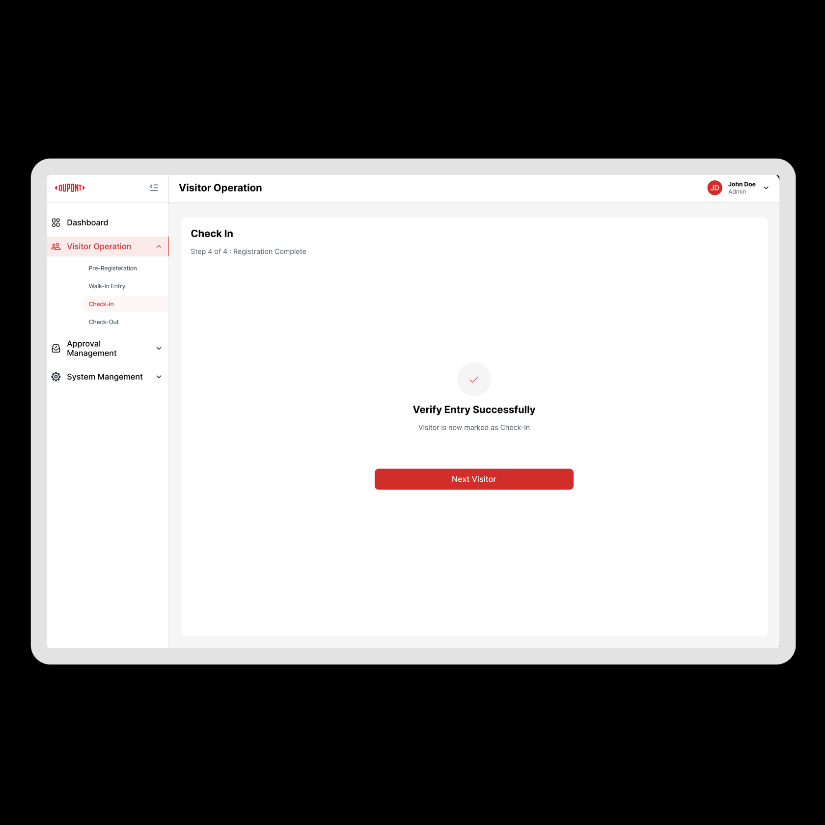
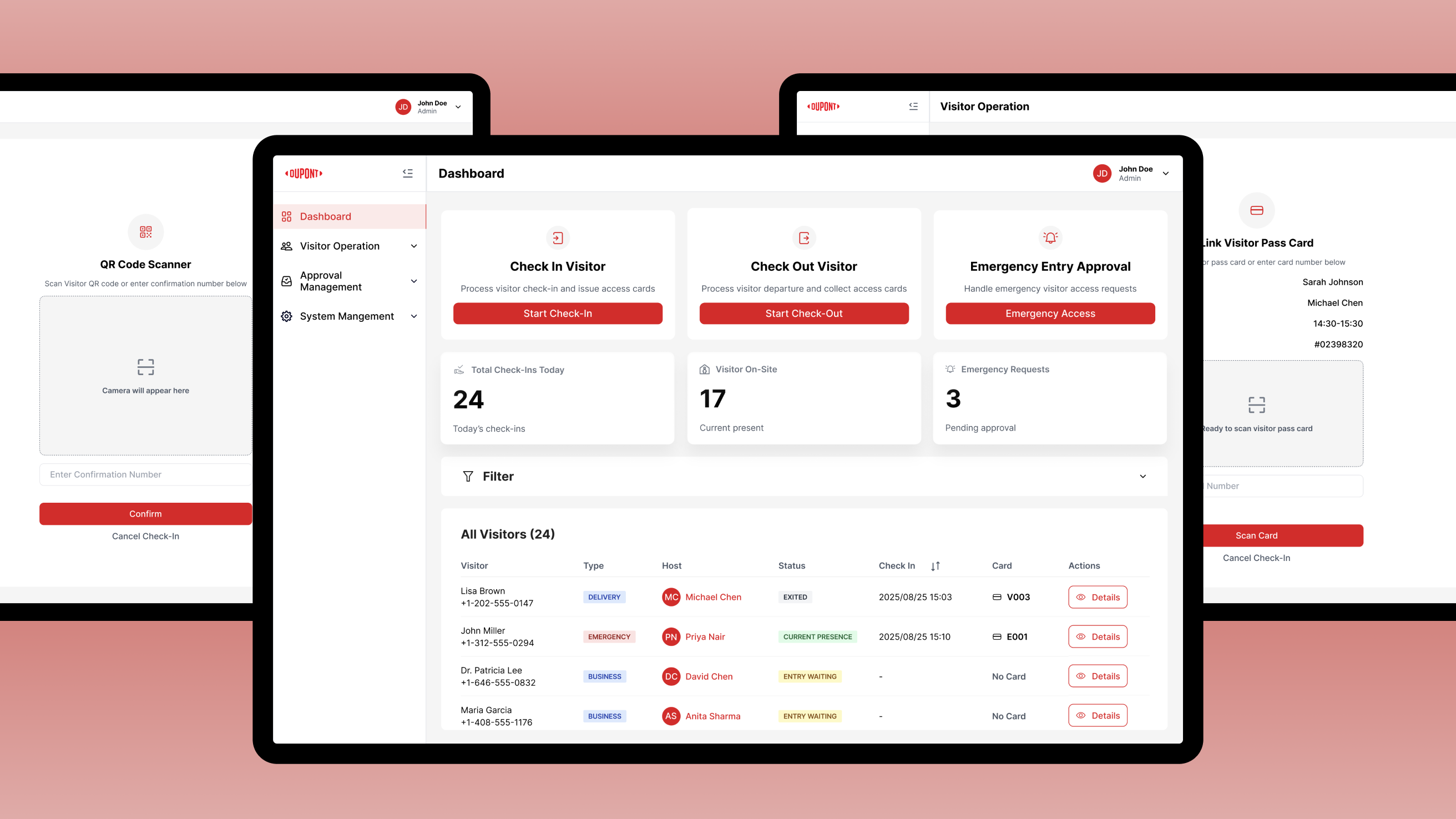
DuPont Taiwan operates chemical manufacturing facilities that handle hazardous materials and sensitive production processes. These plants are classified as high-security environments where even minor lapses in visitor management can pose serious risks.

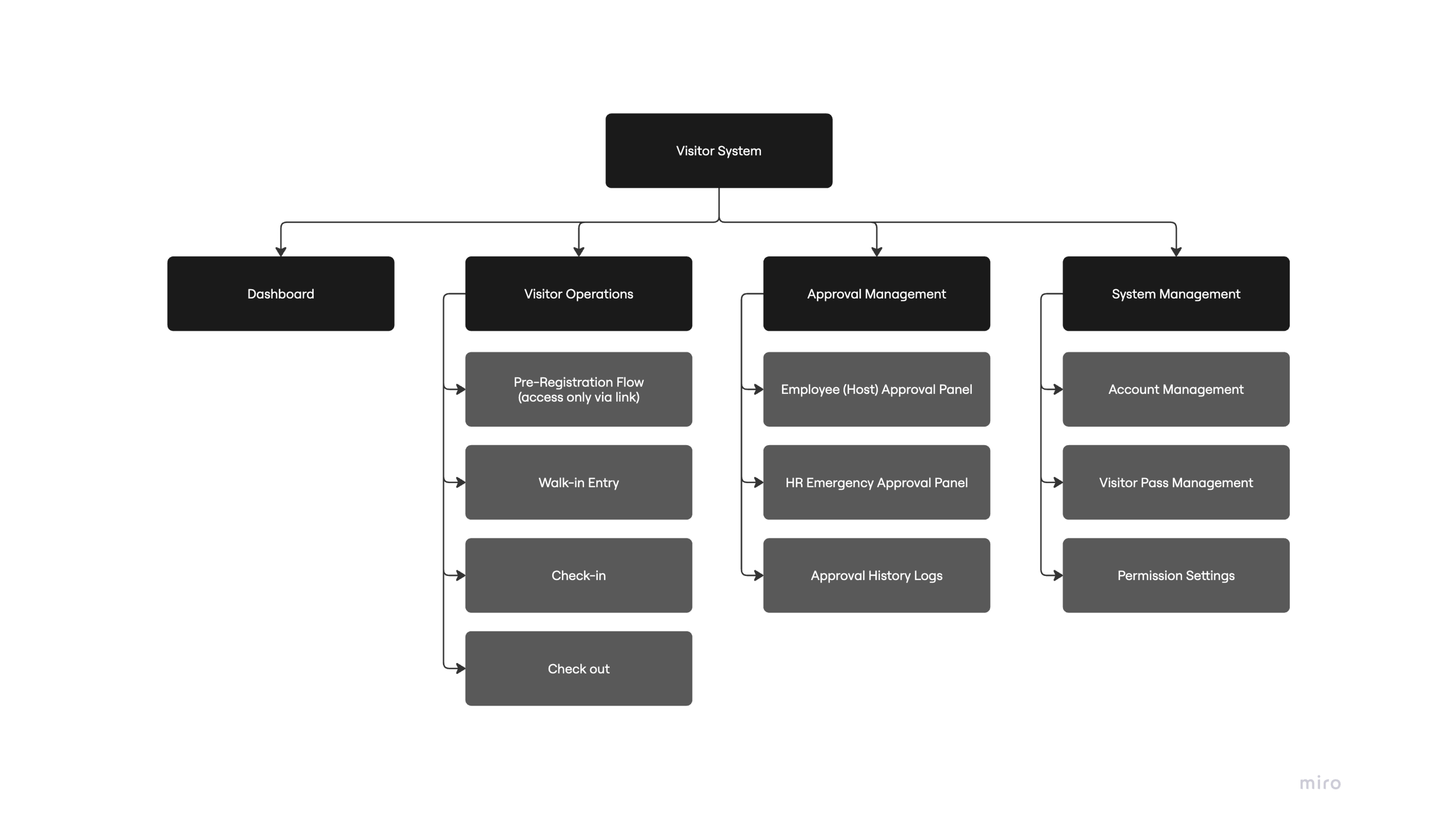
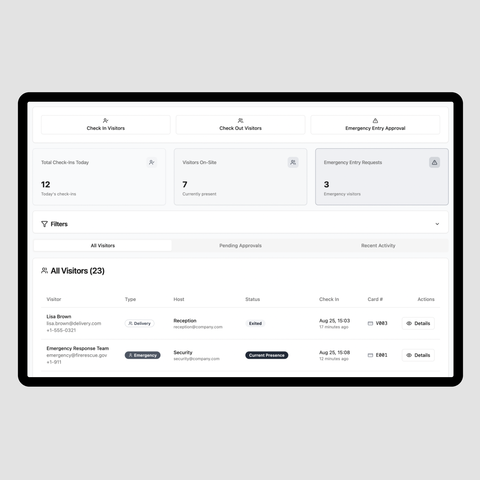
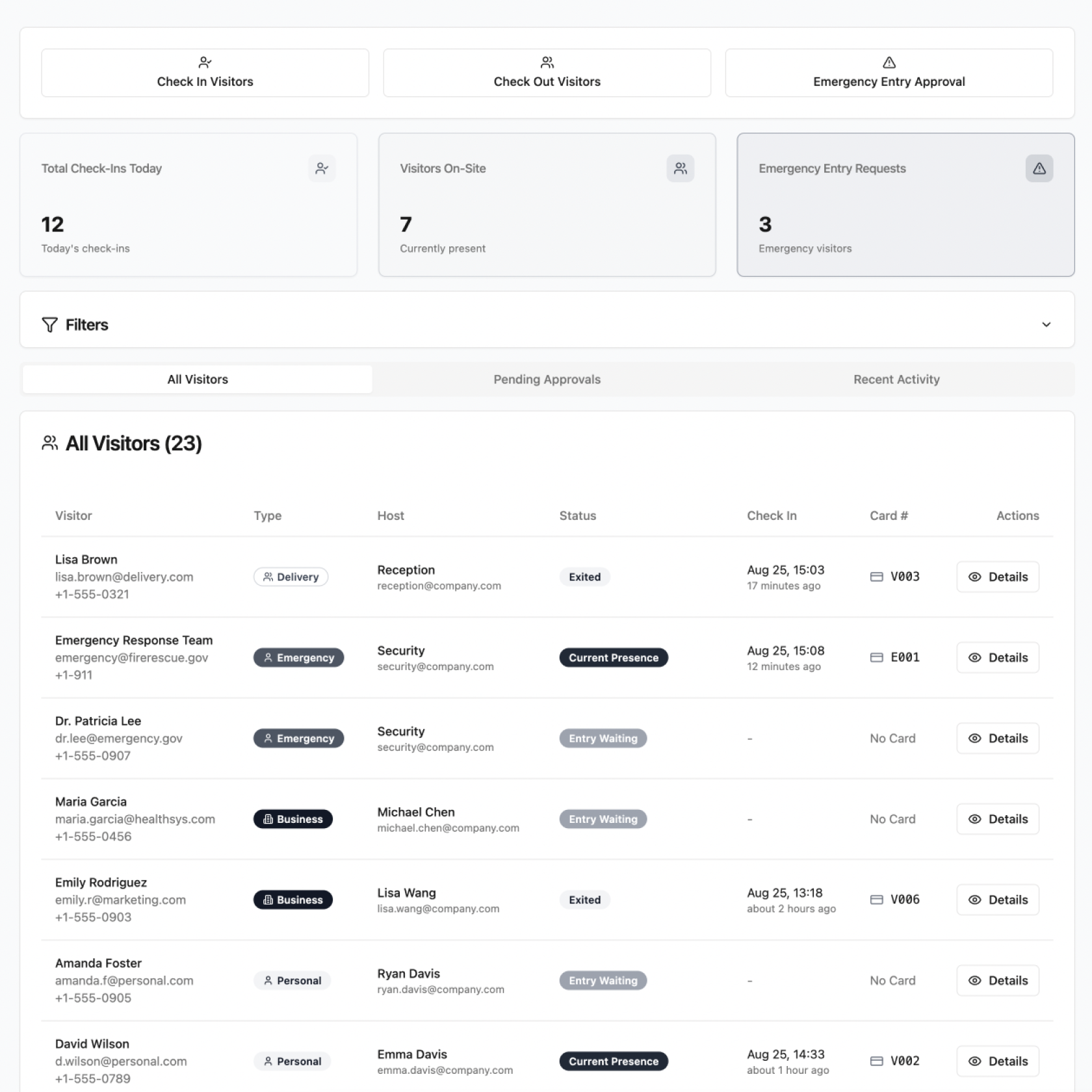
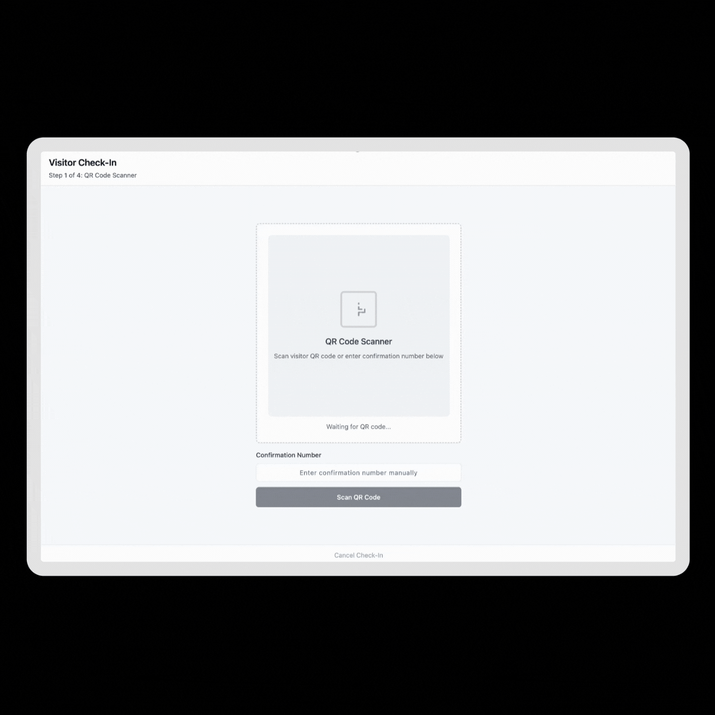
I led the end-to-end design of a visitor management system for DuPont Taiwan, digitizing a paper-based process into a secure, automated workflow. I drove the 0→1 conceptualization and design, conducted two rounds of HR research, facilitated stakeholder alignment, and collaborated with developers.

Duration

3.5 months

Collaborators

1 Product Manager, 2 Developers

Role

Product Designer

Contributions

UX/UI Design
User Interviews
Prototyping
Stakeholder Alignment
Engineer Collaboration

Problem

What made visitor check-ins/outs inefficient

DuPont’s high-security facilities relied on paper forms for visitor check-ins, requiring HR to manually record details, call employees for confirmation, and then re-enter the information into the company system.

The process improvement goals from business angle

The organization saw this as a critical opportunity to redesign the process and set clear business goals for safety, accountability, and workload reduction.

→ Visitor access needed to stay compliant with strict safety rules.
→ Check-ins had to be traceable and accountable.
→ The process should reduce chances of mistakes or skipped steps.
→ HR needed relief from repetitive manual work without weakening security.

Research

Understanding the current process through user interviews

We conducted two contextual interviews with HR front-desk staff (3 participants in total) to understand how our main users handled visitor check-ins/outs day to day.

The first focused on shadowing and open interviews, while the second used task-flow walkthroughs and mid-fidelity wireframe testing.

Analyzing the process through task flows

After the first interviews, we ran a detailed task and flow analysis to uncover where the process broke down. We mapped each user action step by step. Also, captured the task, pain points, risks, and design opportunities at each stages should reduce chances of mistakes or skipped steps.

View Full Size

Insights from user research

From our contextual interviews and task-flow analysis, we uncovered a mix of behavioral patterns and operational bottlenecks.

Operational Insights

→ Unannounced visitors disrupted workflow.
→ Manual ID checks were time-consuming, especially during peak hours.
→ Hosts were often unreachable, which delayed or blocked check-ins.
→ Edge cases (like forgotten approvals) were resolved with inconsistent.

Behavioral Insights

→ HR staff feared being blamed for visitors who bypassed approvals.
→ Approval delays led employees to escort visitors in without clearance.
→ Recurring visitors had to be retyped every time.
→ Post-entry responsibility for visitors was unclear.

Design Goals

Narrow the product scope due to budget and timeline

Focus on solutions that were aligned with business goals, reduced HR workload, and were feasible within existing systems.

→ Accountable access through pre-registration, ID checks, and host approvals
→ Centralized, real-time visitor visibility for HR
→ Reduced manual workload via automation of entry, confirmation, and exit
→ Stronger security with role-based controls
→ Delivering results within existing infrastructure constraints

Information Architecture

Wireframe

Use mid-fidelity wireframes to validate flows with users. Focusing on task clarity, real-time scenarios, and edge cases to make key decisions and user paths clear before moving forward.

Dashboard help cutting effort to manage the visitors

The dashboard centralizes visitor tracking, filters, tasks, and details. While ensuring traceability, enforced approvals, and instant access to safety data.

Filter Interaction

Quick filters surface safety-critical counts., as it reduces lookup time, cuts workload during peak hours, and prevents approval delays that could compromise safety.

Slide-In Visitor Profile Panel

The slide-in panel displays full visitor details without disrupting the main dashboard view.  Enabling faster, consistent decisions while maintaining workflow continuity.

Check in Finish in 4 steps

HR scans QR, reviews details, links card, completes check-in.

Interaction

By introducing QR codes for pre-registered visitors. The flow is similar to what HR was already doing: checking a list, confirming ID, and assigning a visitor card.

Link Card

We tested both facial recognition and physical card linking for identifying visitors. HR staff raised concerns about unreliable detection and privacy. Card linking was faster, familiar, and easier to use.

Final Design

High-fidelity designs to refine components

Filter

We designed filters to work at multiple levels — quick filters from stat cards, advanced filters in the drawer, and chips to make the active state visible. This prevented hidden states and ensured HR could always reset or combine filters without confusion.

Scanning

The QR code and card scanning component was designed with a fallback: if scanning failed, users could enter the information manually. This dual-path approach made the system resilient to hardware or connectivity issues.

Outcome

100% system adoption in 1 months

The digital workflow was quickly embraced by HR staff, replacing paper forms entirely and proving the solution’s ease of use.

Reduced check-in time by 70%

Pre-registration with QR codes and card linking streamlined approvals, cutting long waits during busy hours.

Automated visitor logs

The system generates complete entry and exit records, eliminating manual data entry and ensuring compliance-ready traceability.

HR time reduced by 75% per visitor

Automation and a centralized dashboard freed HR from repetitive tasks, letting them focus on higher-value responsibilities.

Reflection

The actual process felt like being in the middle of nowhere — chaotic, noisy, full of sharp opinions and even louder conversations. It was nothing like how this case study makes it seem — calm, clear, and neatly structured. In reality, the only thing structured was the mess itself.

But what I really enjoyed was how we used diagrams and flows to make sense of the chaos. We always managed to finish the designs on time — at least to the point where we could test and discuss — even if we weren’t ready for the full next step.

It was a lot of tweaking. Sometimes it was about which fields belonged in a table, sometimes about how to fight with the time and the budget but still deliver the best we could. It was constant balancing — but after all the mess, we made it work.